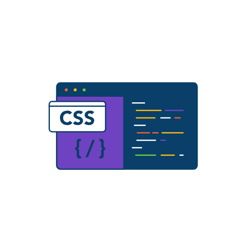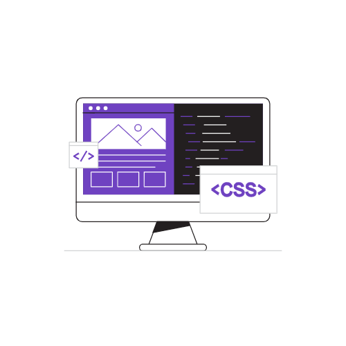
6 Fun Things You Can Do With Just CSS
Love it or hate it, CSS(Cascading Style Sheets) is the language we use to style the HTML elements.
While there are some fabulous preprocessors like SCSS(that get compiled into CSS eventually) and offer more features than normal CSS, this does not mean that you can’t do amazing things by just using plain, standard CSS.
CSS has 520 distinct and while you may not need to know more than 30 or 50 properties, exploring the uncommon CSS properties can surely help you achieve more with just your stylesheets.
Below are 6 amazing things you can do with just CSS:
Create Portraits & Add Effects
CSS allows you to easily add some eye-catching filters and effects to your photos, without you even touching JavaScript.
The above effect is created just by using the background-clip property of CSS.
1 | p{ |
While my p tag contains some text.
You can also use mix-blend-mode which determines how content should blend with the content of the element’s parent and the element’s background.
Linearly Scale Text In Accordance With Viewport
Making your website respond to change in the viewport can be a cumbersome process that often involves rewriting parts of CSS, and testing multiple breakpoints.
But it does not have to be so complicated and tiresome always.
Using just one line of CSS, you can scale text between a minimum and maximum sizes as the viewport increases or decreases.
This is done via the clamp property.
1 | clamp(minimum, preferred, maximum); |
The values are pretty self-explanatory. The clamp property returns a value that is between the minimum and the maximum values. The middle argument, i.e. “preferred” is a percentage of the viewport.
Let’s see this in practice.
1 | width: clamp(500px, 50%, 1500px); |
When the viewport width is 1600px then the preferred value will be 50% of 1600px, that is, 800px. When the viewport is 700px, the preferred should be 50% of 700, that is, 350px.
But since the minimum is 500px, it will return 500px. The same logic applies to the maximum value of 1500px.
You can see from the media provided above as well. The minimum was 450px, hence you don’t see any change when the viewport becomes less than 900px.
Simple Photoshop
CSS provides various properties to edit and apply effects to images. Some of these properties are discussed above, such as the mix-blend-mode .
CSS offers various properties to manipulate images. Some of them are:
- Brightness: filter: brightness(90%)
- Blur: filter: blur(9px)
- Saturation: filter: saturate(4)
- Opacity: filter: oapcity(0.3)
- Hue: filter: hue-rotate(45deg)
- Drop Shadow: filter: drop-shadow(30px 10px 4px #4444dd)
The picture below has a blur filter applied to it.
1 | img{ |
There are more filters and you can read about them here.
Fullscreen
If you have ever made a blog site or any site that involves displaying images, you must have provided some functionality to make the images go full screen.
Even Medium does it, when you click on an image it enlarges.
While you need JavaScript to make elements go full screen, by using the requestFullscreen() method, there is a CSS pseudo-class :fullscreen that allows you to style elements once they are in fullscreen mode.
1 | :fullscreen { |
You can easily apply filters or change background(since elements that go full screen preserve their aspect ratio, leaving a white background behind).
Pie Charts
You can easily create pie charts using CSS only, with just two lines of CSS.
Using conic-gradient() CSS function, you can create images consisting of the gradient with color transitions rotated around a center point.
The most practical use case of this function, in my opinion, is creating pie charts.
1 | background: conic-gradient(red 20%, purple 0 60%, yellow 0); |
The above code will render the following:
The result of the conic-gradient() function is an object of the gradient datatype.
You can find browser compatibility here.
Gradient Text
Gradients when used correctly can provide your site with a breath of fresh air.
Chances are you already know how to work with gradients. If not, you can always use sites like Grabient which lets you customize the gradient and provide the CSS for it.
But do you know you can easily apply a gradient to text as well?
1 | .text { |
And you get awesome gradient text with just this.
Conclusion
HTML and CSS are the fundamental building blocks of web development and it’s a myth you can’t build some great sites using just these two technologies.
While you need JavaScript for functionality, HTML and CSS alone can help you build beautiful marketing and landing sites with bare minimum JavaScript(for converting leads).
I have seen many freelancers get away with just CSS and HTML skills.
I hope you enjoyed this article!
Recommended reading
 wechat
 alipay